Topic 2: Reflection

Reflecting on Data Literacy

Although prior to this topic, I was aware of the importance in assessing the reliability of data and statistics, conducting my own research and learning from others has really reinforced it.

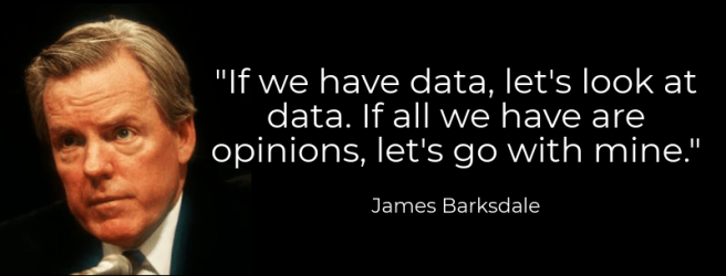
Joanna’s comment provided me with some food for thought on my own post on data literacy – there is no point trying to interpret data from an unreliable author (Li, 2013) – to which I agreed with. However, this led to an interesting discussion where I learnt that even credible authors can take advantage of our trust and mislead us deliberately, to their advantage.

Learning About Information Literacy

As I researched data literacy, it was interesting to visit other students’ posts on information literacy.

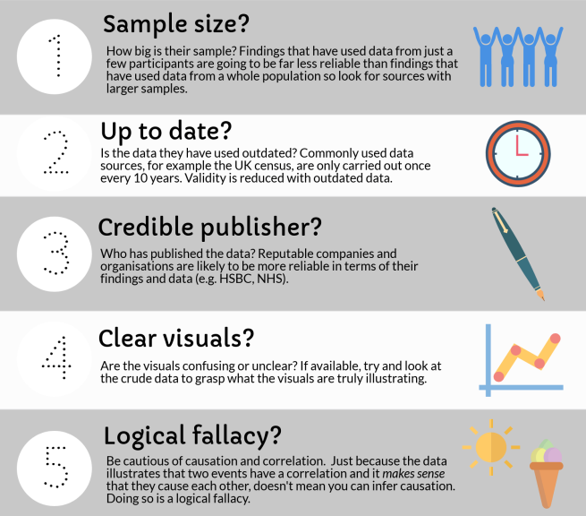
Anna’s post introduced me to “fake news” and the term ‘digital naivety’, suggesting that although young adults are generally perceived digitally savvy, they can be equally as likely to be naive when exposed to fake news as the less digitally savvy population. Coinciding with my topic of data literacy, I reflected on the fact that we can also be naive to false data. Furthermore, some of Anna’s tips for evaluating the validity of sources were useful to add to my own.

Fake news
Image from Mulraney (2017)

Conducting my own research on the topic, I challenged Anna’s post with some evidence that fake news can be beneficial in some aspects (McGregor, J), although we did agree it was predominantly detrimental to society.

Stefan’s post emphasised the damage fake news can cause politically and the efforts some organisations such as Facebook are making to reduce the spread of fake news. Investigating this, I learnt these tools are sometimes triggering the opposite effect.

Conclusion

Concluding this topic, I have learnt that media literacy is a skill that is becoming increasingly important as fake news and fake data becomes more abundant and easier to reach us. I look forward to adopting the new skills taught by others, to improve the authenticity of my work.

[Word count: 303 words]

My comment on Anna’s post
My comment on Stefan’s post

Bibliography

Li, J. (2013) 5 Ways to Avoid Being Fooled by Statistics. Available from: http://www.iacquire.com/blog/5-ways-to-avoid-being-fooled-by-statistics

McGregor, J. (2017) Two Reasons Fake News is Good for Society. Available from: https://www.forbes.com/sites/jaymcgregor/2017/02/07/why-fake-news-is-actually-good-for-the-world/#10b7ddae3771

Mulraney, F. (2017) Sharing “Fake News” in Ireland Could Soon Be Illegal. Available from: https://www.irishcentral.com/news/politics/fake-news-ireland

Topic 2: Assessing Online Information – Data Literacy

new-piktochart_28733757Dekkers (2018) created using the software Piktochart
Quote from Tanner (2016)

Data Literacy

As Barksdale succinctly expressed in the quote above – a claim, in absence of supporting data, is about as valuable as an opinion. Reliable data is imperative to virtually every sector of the economy (Olavsrud, 2013).

Whether we connect with data for educational, vocational or personal purposes, it is crucial we can make correct deductions, identify any accidental or deliberately misleading conclusions and evaluate its validity. Failing this could not only detrimentally impact our own learning, but others we interact with in online communities.

Common Data Mistakes

  1. Correlation vs. Causation

Causality can only be inferred if there is proven cause and effect between two variables (Sidebottom, 2015) whereas correlation means a certain relationship (negative or positive) exists between two events, but they do not necessarily cause one another. We cannot say that hot weather directly causes increased ice cream sales, but there is certainly a correlation. The video below describes this fallacy more thoroughly.

ASAPScience (2017)

2. Incorrect Interpretation

As data becomes both more abundant and accessible, it’s important to ensure we are equipped to correctly interpret what we see. Misleading visuals can mean false inferences are easier to make.

new-piktochart_28760748
Dekkers (2018) created using the software Piktochart
Diagrams from Wikipedia (2018)

Let’s say the pie chart represents UK GDP. Looking at the 3D pie chart, we might be inclined to say that C composes at least as much as A, and D composes more than B. However, looking from the 2D perspective, figures suggest otherwise.

There are numerous other visuals causing these types of errors:

  • Improper scaling
  • Truncated y axis
  • Omitted data

(Kwapien, 2015)

Data Tips

So how can we ensure we gain reliable data and interpret it correctly? The infographic below outlines some tips.

new-piktochart_28761276.png
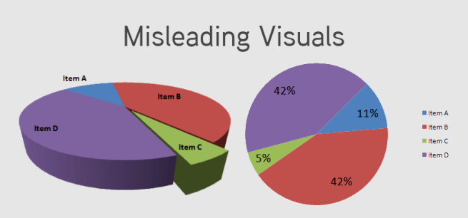
Dekkers (2018) created with the software Piktochart
Information from University of Southampton (2017)

Summary

With ever-increasing data in our World, it is important to be vigilant upon encountering it. This helps to maintain an authentic online learning environment from which we can all benefit.

[Word count: 300]

Bibliography

ASAPScience (2017) This ≠ That. Available from: https://www.youtube.com/watch?v=gxSUqr3ouYA

Kwapien, A. (2015) Misleading Data Visualisation Examples. Available from: https://www.datapine.com/blog/misleading-data-visualization-examples/

Olavsrud, T. (2013) 10 Intriguing Real-World Uses for Big Data. Available from: https://www.computerworld.com/article/2473691/big-data/92712-10-Real-World-Big-Data-Deployments-That-Will-Change-Our-Lives.html#slide3

Sidebottom, T. (2015) Correlation vs. Causation: Why Marketers Should Stop Saving For a Rainy Day. Available from: http://www.fourthsource.com/general/correlation-vs-causation-marketers-stop-saving-rainy-day-19411

Tanner, T. (2016) Why Data Matters in a Membership Organisation. Available from: https://www.ats.edu/blog/data-matters/“if-we-have-data-lets-look-data-if-all-we-have-are-our-opinions-lets-go-mine”-why-data-matters-0

University of Southampton (2017) Data Literacy. Available from: https://www.futurelearn.com/courses/learning-network-age/4/steps/303355

Wikipedia (2018) Misleading Graphs. Available from: https://en.wikipedia.org/wiki/Misleading_graph